Sunday, November 7, 2010
Class 3 - Placing Graphics, Drawing Tools, Review (Make up class)
Homework (Readings):
Chapter 11: Indesign Drawing Tools and the Bezier Curve
Chapter 12: Graphics
Chapter 13: Frames and GraphicChapter
Readings and class materials are available on the Share Out Folder.

Importing Graphics
Learn how to add images to an InDesign document by using the place function. Use the pasteboard as a holding location for images before final placement.
Placing Images in InDesign CS5
Rafael Conception goes over his favorite ways to place images inside of an InDesign document. These include placing multiple images, and using the Command Shift to create a giant grid of images, and using the Autofit button.

Chapter 11: Indesign Drawing Tools and the Bezier Curve
Chapter 12: Graphics
Chapter 13: Frames and GraphicChapter
Readings and class materials are available on the Share Out Folder.
Homework (In Class Assignment)
- MacMillan Bloedel concept
- Use Files in the Class 3 Folder, in the Project 2 Folder, follow Lesson Plan Project 2
- When complete, follow instructions on using the FTP to put in Folder In box, and Package the Indesign files, and export a PDF.
Importing Graphics
Learn how to add images to an InDesign document by using the place function. Use the pasteboard as a holding location for images before final placement.
Placing Images in InDesign CS5
Rafael Conception goes over his favorite ways to place images inside of an InDesign document. These include placing multiple images, and using the Command Shift to create a giant grid of images, and using the Autofit button.

Saturday, November 6, 2010


Assignment 3- The Character of Type
Due: November 20, 2010

Check out the Type Gallery for some inspirational approaches to the art of typography.
This project explores the personalities of type. Each font is a member of a family, with its own class, cultural, social, commercial and art historical references; each type has its own unique characteristics, functions, purposes and personalities. It communicates something unique and individual.
In this project you will choose a specific font; research its family, purpose, personality; and using the elements of design create a poster composition that illustrates and conveys its unique character and the essence of its personality.
This kind of poster is usually used for design trade shows, to show off the talents of the font’s designer and to sell it for use in the marketplace.
The posters must be 11”x17” and use full colour. You must provide a headline or display text capturing the essence of the font, as well as some body text elaborating on its use (either literally or suggestively). Consider using appropriate quotes from popular culture, literature, slang, or even foreign language and set it in your poster using the font.
Be sure to show the all the font’s characters in your design, as in a keyboard layout.
For the main image develop a composition using the type, paying attention to its shape. You may use original or stock images to convey the font’s character, but these should not be the focus of your composition.
When possible, give credit in your poster to the name of the font designer and where the font may be purchased (company name, web site).
Refer to the designer’s checklist during your design process and before you hand in your final project.
Before converting your Illustrator file into an Adobe Acrobat file for printing, convert all fonts to outlines.
Deliverables:
- one 11”x17” colour print on cardstock or photo paper
- one 11”x17” colour print on cardstock or photo paper
- one *.pdf file labeled with your name and the assignment number (i.e.
Student's Name [first name, last name}_MDIA 1069_Assignment 3.pdf) - make available in the class in folder
Evaluation will be based upon the following criteria:
- Has the student followed the assignment directions?
- Do the compositions reflect an understanding of the principles explored in the class sessions?
- Is there an interesting or innovative approach to the compositions?
- Has the student clearly identified a message/theme, and is this readily understandable to viewers?
- Did the student reveal the character of the font?
- Did the student invest an adequate level of time and energy in completing this assignment?
Additional Notes:
Feel free to use shareware fonts available from web sites on the internet, such as www.dafont.com.
Check out the typography links on our course blog, and do a google search for more information on typography, fonts, etc. when doing your research.
How to submit assignments for MDIA 1069
FILE NAMING FOR ASSIGNMENTS
When submitting assignments to the In Folder, please use this filing naming convention:
· Student Name [first, last] | MDIA 1069_Assignment 2.pdf
· Please put in the MDIA 1069 In Box Folder
____________________________________________________
Using ftp to access the In Folder and the Out Folder from home.
In order to safely transfer your assignments into the In Folder, MDIA 1069, Michael Jorgensen’s class, please use the FTP method. Using an application such as Fetch, log in host as: share.bcit.ca, enter your username, Connect using: TLS/SSL, and check mark “enable encryption.”
____________________________________________________
Packaging the InDesign File / Zipping
When submitting your assignment, please Package your InDesign files so all images and fonts are linked and put into a folder.
Instructions:
You can gather the files you’ve used, including fonts and linked graphics, for easy handoff to a service provider. When you package a file, you create a folder that contains the InDesign document (or documents in a book file), any necessary fonts, linked graphics, text files, and a customized report. This report, which is saved as a text file, includes the information in the Printing Instructions dialog box; a list of all used fonts, links, and inks required to print the document; and print settings.
InDesign performs an up-to-date preflight check. The Package Inventory dialog box indicates any detected problem areas. You can also give your service provider a composite PDF file made from your document or a PostScript file.
Do one of the following to open the Package dialog box:
Choose File > Package. (If Package does not appear in the File menu, try choosing a different workspace, such as Window > Workspace > Advanced.)
In the Book panel menu, choose Package Book or Package Selected Documents, depending on whether all, some, or none of the documents are selected in the Book panel.
· Update Graphic Links In Package Changes graphic links to the package folder location.
· Use Document Hyphenation Exceptions Only If this option is selected, InDesign flags this document so that it doesn’t reflow when someone else opens or edits it on a computer that has different hyphenation and dictionary settings. You can turn on this option when sending the file to a service provider.
· Include Fonts And Links From Hidden And Non-Printing Content Packages the objects located on hidden layers, hidden conditions, and layers for which the Print Layer option is turned off. When this option is not selected, the package includes only what is visible and printable in the document when you create the package.
· View Report Opens the printing instructions report in a text editor immediately after packaging. To edit the printing instructions before completing the packaging process, click the Instructions button.
· Click Package to continue packaging.
Then right click on the resulting folder and Zip it, before you “put” the file using FTP client.
____________________________________________________
Creating a PDF file from InDesign
Adobe PDF presets
A PDF preset is a group of settings that affect the process of creating a PDF. These settings are designed to balance file size with quality, depending on how the PDF will be used. Most predefined presets are shared across Adobe Creative Suite components, including InDesign, Illustrator, Photoshop, and Acrobat. You can also create and share custom presets for your unique output requirements.
A few of the presets listed below are not available until you move them—as needed—from the Extras folder (where they are installed by default) to the Settings folder. Typically, the Extras and Settings folders are found in (Windows Vista) ProgramData\Adobe\AdobePDF, (Windows XP) Documents and Settings\All Users\Application Data\Adobe\Adobe PDF, or (Mac OS) Library/Application Support/Adobe PDF. Some presets are not available in some Creative Suite components.
The custom settings are found in (Windows XP) Documents and Settings/[username]/Application Data/Adobe/Adobe PDF/Settings, (Windows Vista) Users/[username]/AppData/Roaming/Adobe/Adobe PDF/Settings, or (Mac OS) Users/[username]/Library/Application Support/Adobe/Adobe PDF/Settings.
Review your PDF settings periodically. The settings do not automatically revert to the default settings. Applications and utilities that create PDFs use the last set of PDF settings defined or selected.
· High Quality Print Creates PDFs for quality printing on desktop printers and proofing devices. This preset uses PDF 1.4 (Windows) or PDF 1.6 (Mac OS), downsamples color and grayscale images to 300 ppi and monochrome images to 1200 ppi, embeds subsets of all fonts, leaves color unchanged, and does not flatten transparency (for file types capable of transparency). These PDFs can be opened in Acrobat 5.0 and Acrobat Reader 5.0 and later. In InDesign, this preset also creates tagged PDFs.
· Illustrator Default (Illustrator only) Creates a PDF in which all Illustrator data is preserved. PDFs created with this preset can be reopened in Illustrator without any loss of data.
· Oversized Pages (Acrobat only) Creates PDFs suitable for viewing and printing of engineering drawings larger than 200 x 200 inches. These PDFs can be opened in Acrobat and Reader 7.0 and later.
· PDF/A-1b: 2005 (CMYK and RGB) (Acrobat only) Used for long-term preservation (archival) of electronic documents. PDF/A‑1b uses PDF 1.4 and converts all colors to either CMYK or RGB, depending on which standard you choose. These PDFs can be opened in Acrobat and Reader versions 5.0 and later.
· PDF/X‑1a (2001 and 2003) PDF/X‑1a requires all fonts to be embedded, the appropriate marks and bleeds to be specified, and color to appear as CMYK, spot colors, or both. Compliant files must contain information describing the printing condition for which they are prepared. PDF files created with PDF/X‑1a compliance can be opened in Acrobat 4.0 and Acrobat Reader 4.0 and later.
· PDF/X‑1a uses PDF 1.3, downsamples color and grayscale images to 300 ppi and monochrome images to 1200 ppi, embeds subsets of all fonts, creates untagged PDFs, and flattens transparency using the High Resolution setting.
· Note: The PDF/X1‑a:2003 and PDF/X‑3 (2003) presets are placed on your computer during installation but are not available until you move them from the Extras folder to the Settings folder.
· PDF/X‑4 (2008) In Acrobat 8, this preset is called PDF/X‑4 DRAFT to reflect the draft state of the ISO specification at Acrobat ship time. This preset is based on PDF 1.4, which includes support for live transparency. PDF/X‑4 has the same color management and International Color Consortium (ICC) color specifications as PDF/X‑3. You can create PDF/X‑4-compliant files directly with Creative Suite 3 components (Illustrator, InDesign, and Photoshop). In Acrobat 8, use the Preflight feature to convert PDFs to PDF/X‑4 DRAFT.
· PDF files created with PDF/X‑4 compliance can be opened in Acrobat 7.0 and Reader 7.0 and later.
Press Quality Creates PDF files for high-quality print production (for example, for digital printing or for separations to an imagesetter or platesetter), but does not create files that are PDF/X-compliant. In this case, the quality of the content is the highest consideration. The objective is to maintain all the information in a PDF file that a commercial printer or print service provider needs in order to print the document correctly. This set of options uses PDF 1.4, converts colors to CMYK, downsamples color and grayscale images to 300 ppi and monochrome images to 1200 ppi, embeds subsets of all fonts, and preserves transparency (for file types capable of transparency).
These PDF files can be opened in Acrobat 5.0 and Acrobat Reader 5.0 and later.
Note: Before creating an Adobe PDF file to send to a commercial printer or print service provider, find out what the output resolution and other settings should be, or ask for a .joboptions file with the recommended settings. You might need to customize the Adobe PDF settings for a particular provider and then provide a .joboptions file of your own.
Rich Content PDF Creates accessible PDF files that include tags, hyperlinks, bookmarks, interactive elements, and layers. This set of options uses PDF 1.5 and embeds subsets of all fonts. It also optimizes files for byte serving. These PDF files can be opened in Acrobat 6.0 and Adobe Reader 6.0 and later. (The Rich Content PDF preset is in the Extras folder.)
Note: This preset was called eBook in earlier versions of some applications.
Smallest File Size Creates PDF files for displaying on the web, an intranet, or for email distribution. This set of options uses compression, downsampling, and a relatively low image resolution. It converts all colors to sRGB and embeds fonts. It also optimizes files for byte serving.
These PDF files can be opened in Acrobat 5.0 and Acrobat Reader 5.0 and later.
Standard (Acrobat only) Creates PDF files to be printed to desktop printers or digital copiers, published on a CD, or sent to a client as a publishing proof. This set of options uses compression and downsampling to keep the file size down, but also embeds subsets of all (allowed) fonts used in the file, converts all colors to sRGB, and prints to a medium resolution. Note that Windows font subsets are not embedded by default. PDF files created with this settings file can be opened in Acrobat 5.0 and Acrobat Reader 5.0 and later.
–
=

The Hyphen, the En Dash and the Em Dash.

As a professional designer, you must know the difference between the hyphen, and the en and em dashes. While this article is written for web design, it is equally true for print design.
Click here to read about hyphens and dashes.
What the hell is the Fibonacci Sequence?

Click here to view an excellent flash animation how the Fibonacci Sequence works, and is related to the spiral and golden mean.
Everything Old is New: Typographic Styles

Timeline of Historical Movements
1840-1900 Victorian
1850-1900 Arts & Crafts
1890-1905 Art Nouveau
1905-1925 Expressionism
1910-1925 Cubism
1910-1945 Futurism
1915-1925 Dada, De Stijl
1915-1930 Constructivism
1920-1935 Bauhaus
1925-1940 Art Deco
1925-1945 Surrealism
1930-1970 Modern
1945-1970 New York School
1950- International
1960-1970 Pop, Psychedelia
1970- Basel
1975-1990 Punk
1975-1990 Postmodern
1990- Global
Click here to view the class notes
The Fine Print: Typographical Hierarchies
Click here to view powerpoint slides.
Click here to read A Brief History of Type.
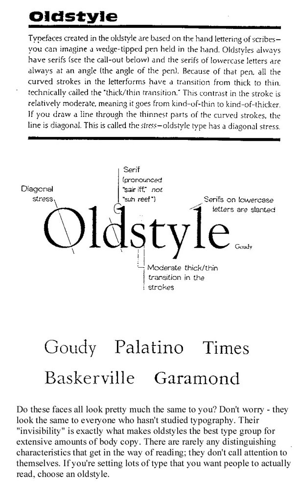
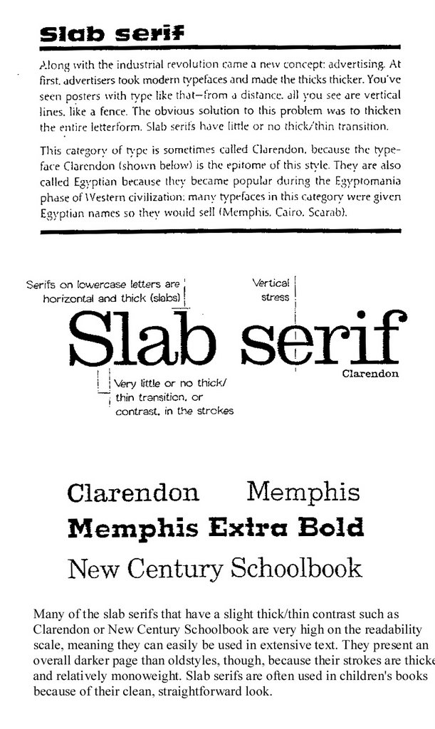
Categories of Type
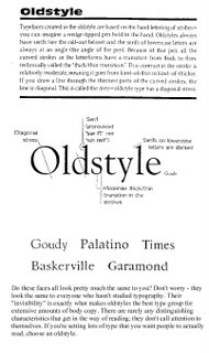
Oldstyle

Slab Serif
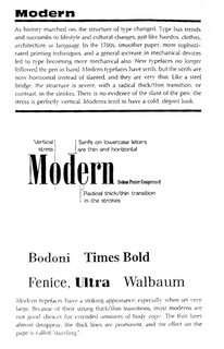
Modern
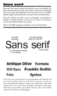
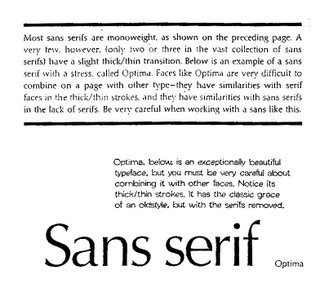
San Serif
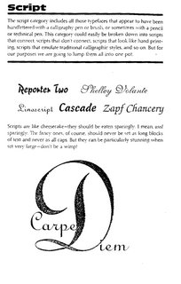
Script
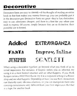
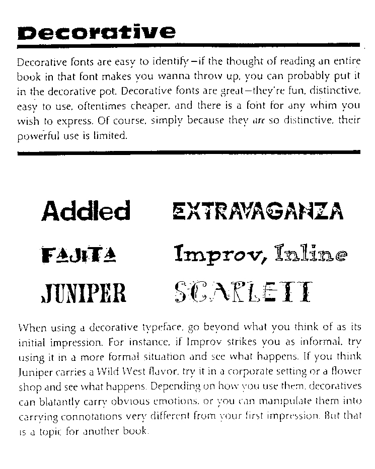
Decorative

Bitmapped Fonts
A bitmap font is one that stores each glyph as an array of pixels (that is, a bitmap). It is less commonly known as a raster font. Bitmapped fonts are particularly useful for small type in digital media when used as a gif or jpg image on web sites or in flash animation, because they do not require rastering for the curves as with standard typefaces. Since the characters are made up of square pixels, the typefaces do not look blurry at small sizes and remain sharp appearing.

The Point System
Points
• 72 points (pts.) to the inch in height, 36pts = 1/2", 18 pts = 1/4”
• used for measuring type size
• refers to the height of the capital letters
General Rules
• do not use more than 2 typefaces in an ad or document
• do not use more than 1 headline face or body copy face
• the types you use should be either very similar (harmony) or very dissimilar (contrast)
• for readability, headlines are often sans-serif and body text is serif, avoid all caps, and use even spacing
• the bigger the type face, the wider the column
• 39 characters of lowercase letters, break long portions of text into columns
• flush left is usually easier to read because letter spacing is more even
• fully justified is often used in books and newspapers
• flush right is usually used for small portions of text
• never ad extra kerning to copy - only use kerning on short headlines or subheadlines of one or two words
• avoid punctuation in headlines
• avoid capitalizing each word in headlines - only capitalize the first word or proper names
• using all lower case on headlines and subheads associates the company or product with creativity
• be careful with word emphasis and end of lines
• the negative letter space is important to appearance and readability
Orphans and Widows: Finetuning

Do you leave readers dangling? Words left hanging leave readers in the dark. In desktop publishing, widows and orphans are those words or short phrases at the end or beginning of paragraphs that are left to sit alone at the top or bottom of a column — separated from the rest of the paragraph.
Click here to read the rest of the article by Jacci Howard Bear from About.com.
Finetuning
• reduce kerning up to -2 pts using the tracking option in a paragraph
• reduce width of text by up to 90% - preferably as little as possible
Click here to read A Brief History of Type.
Categories of Type
Oldstyle
Slab Serif

Modern


San Serif

Script
Decorative

Bitmapped Fonts
A bitmap font is one that stores each glyph as an array of pixels (that is, a bitmap). It is less commonly known as a raster font. Bitmapped fonts are particularly useful for small type in digital media when used as a gif or jpg image on web sites or in flash animation, because they do not require rastering for the curves as with standard typefaces. Since the characters are made up of square pixels, the typefaces do not look blurry at small sizes and remain sharp appearing.

The Point System
Points
• 72 points (pts.) to the inch in height, 36pts = 1/2", 18 pts = 1/4”
• used for measuring type size
• refers to the height of the capital letters
General Rules
• do not use more than 2 typefaces in an ad or document
• do not use more than 1 headline face or body copy face
• the types you use should be either very similar (harmony) or very dissimilar (contrast)
• for readability, headlines are often sans-serif and body text is serif, avoid all caps, and use even spacing
• the bigger the type face, the wider the column
• 39 characters of lowercase letters, break long portions of text into columns
• flush left is usually easier to read because letter spacing is more even
• fully justified is often used in books and newspapers
• flush right is usually used for small portions of text
• never ad extra kerning to copy - only use kerning on short headlines or subheadlines of one or two words
• avoid punctuation in headlines
• avoid capitalizing each word in headlines - only capitalize the first word or proper names
• using all lower case on headlines and subheads associates the company or product with creativity
• be careful with word emphasis and end of lines
• the negative letter space is important to appearance and readability
Orphans and Widows: Finetuning

Do you leave readers dangling? Words left hanging leave readers in the dark. In desktop publishing, widows and orphans are those words or short phrases at the end or beginning of paragraphs that are left to sit alone at the top or bottom of a column — separated from the rest of the paragraph.
Click here to read the rest of the article by Jacci Howard Bear from About.com.
Finetuning
• reduce kerning up to -2 pts using the tracking option in a paragraph
• reduce width of text by up to 90% - preferably as little as possible
Color Trends
Come and meet the mood-evoking personalities of today's color palettes. Images and text from Sherwin Williams. Click on subtitle to read more, and use the online color palette generator.

Balanced Living Color Trend Palette 2007

There's nothing black and white about green. The renewed appreciation for a balanced, healthy lifestyle is evident in organic living and mindbody workouts. Natural fibers, recycled materials, simple furnishings - these are just a few of the touches to create balanced living.
Sultry Origins

From the fashions of Beverly Hills to the street couture of New York City, global ethnic influences are turning up everywhere. Bold, spice-infused colors. Intricate handcrafted quality. Clean, simple lines. A distinctive, Old World feel - these express the essence of sultry origins.
Understated Elegance

Today's neutral palettes are sophisticated. Warm tones blend with cool. Natural materials add depth and character. A pendant lamp adds luster to textures and finishes. Artisan pottery compliments exquisite furniture. It's luxury made affordable. Understated elegance for all.
Virtual Re-mix

Nostalgia is booming. It's the integration of past and present, the visual equivalent of a greatest hits CD, a tendency to mix rather than match. You can see it in all things retro and vintage, from a '60s pattern on a bathroom mat to a claw-foot tub that harkens back to days gone by.
Kinetic Contrasts

Look to fashion and advertising and you will see the impact of kinetic contrasts. It pulsates with energy and style. Intense color accents, spare minimalist backgrounds, geometrically shaped furniture and contemporary art help create this wow factor.
Pantone Designer Paint Colors 2007
When we asked the designers to translate their spring 2007 fashion colors to interior paint colors and describe the room, this is what they said:

Pantone Spring 2007 color trends

Click on subtitle to read more.
More Color Trends 2007

Fashion Trendsetter, online fashion and color forecasting website today announced the release of the Spring/Summer 2008 color trends as two editions; Vol.II and Vol.III. For the summer 2008, two different stories and four sub trend cards are prepared for each color trends... Click on subtitle to read more.
Sherwin-Williams' color forecast for 2010, part one

Balanced Living Color Trend Palette 2007

There's nothing black and white about green. The renewed appreciation for a balanced, healthy lifestyle is evident in organic living and mindbody workouts. Natural fibers, recycled materials, simple furnishings - these are just a few of the touches to create balanced living.
Sultry Origins

From the fashions of Beverly Hills to the street couture of New York City, global ethnic influences are turning up everywhere. Bold, spice-infused colors. Intricate handcrafted quality. Clean, simple lines. A distinctive, Old World feel - these express the essence of sultry origins.
Understated Elegance

Today's neutral palettes are sophisticated. Warm tones blend with cool. Natural materials add depth and character. A pendant lamp adds luster to textures and finishes. Artisan pottery compliments exquisite furniture. It's luxury made affordable. Understated elegance for all.
Virtual Re-mix

Nostalgia is booming. It's the integration of past and present, the visual equivalent of a greatest hits CD, a tendency to mix rather than match. You can see it in all things retro and vintage, from a '60s pattern on a bathroom mat to a claw-foot tub that harkens back to days gone by.
Kinetic Contrasts

Look to fashion and advertising and you will see the impact of kinetic contrasts. It pulsates with energy and style. Intense color accents, spare minimalist backgrounds, geometrically shaped furniture and contemporary art help create this wow factor.
Pantone Designer Paint Colors 2007
When we asked the designers to translate their spring 2007 fashion colors to interior paint colors and describe the room, this is what they said:

Pantone Spring 2007 color trends

Click on subtitle to read more.
More Color Trends 2007

Fashion Trendsetter, online fashion and color forecasting website today announced the release of the Spring/Summer 2008 color trends as two editions; Vol.II and Vol.III. For the summer 2008, two different stories and four sub trend cards are prepared for each color trends... Click on subtitle to read more.